Thursday 17 July 2014

Latest App For Smarter Podcasts

Latest App For Smarter Podcasts

Hello Everyone! Developer Marco Arment is best known for his read-it-later app Instapaper, and for his former role as Tumblr's lead developer.Arment's latest project, however, tackles an entirely different medium: podcasts. The developer just rolled out the first version of Overcast, a deceptively simple, yet powerful, podcast player. app was inspired by the simplicity of iOS 7, according to Arment."iOS 7 shook up the market, and by pure luck, shifted high-end iOS design away from fashions I could never compete in  heavy use of textures and complex graphical widgets into what I could actually do: simplicity, space and typography," he wrote in a blog post.But it's two of Overcast's premium features (both of which are available for a single $4.99 in-app purchase) that really set it apart from other players: Smart Speed and Voice Boost.


Smart Speed enables you to listen to their podcasts faster by speeding up the silences within the recordings. Arment said the feature makes listening faster, but adds no detectable changes to a podcast's audio. Voice Boost is a feature that essentially equalizes a podcast's volume, so listeners won't have to constantly turn it up or down at different points while listening— an issue that crops up more frequently with amateur podcasts.

Overcast is free, but the one in-app purchase buys you all of its premium features, including a sleep timer and the ability to download podcasts over cellular data, along with Smart Speed and Voice Boost.

For those who don't care to pay for the bonus features, the app has a very simple interface that makes it easy to find, listen and subscribe to podcasts. In addition to browsing titles by name, you can also link the app to your Twitter account to see recommendations from people you follow. The app also has a dedicated web player that allows you to pause a podcast from your iPhone, and resume listening on the web.
                                   Overcast app

Overcast was in development for a long time; Arment first announced the app last September during the XOXO festival, and it spent more than two months in beta before its official release Wednesday.

Overcast is currently iPhone-only. Arment said he is working on an iPad app, but has no plans to create an Android version.

ALSO LATEST APPS FOR ALL MOBILES: CLICK HERE

Wednesday 16 July 2014

iOS Latest App Released For Users

iOS Latest App Released For Users

Hi My Dear Friends! iOS users will be prompted to update their devices to the newest iteration of Apple's mobile operating system. As difficult as it is to believe, we're already onto the sixth version of the OS, which continues to be updated with new features on a yearly basis. After pushing out so many upgrades critical to plugging a few major feature holes, the vast majority of its 200 advertised enhancements are strictly granular, as Apple continues to polish its popular OS.That doesn't mean, though, that this build is coming to the masses without any jarring UI changes: Apple has declared independence from Google by adopting its own Maps, added a few nice features to Mail and iCloud, thrown Facebook integration into the mix and introduced the Passbook for paperless tickets. The question is, how does it stack up against previous refreshes? Read on to find out.


Quick peruse through the App Store reveals no shortage of password management apps, indicative perhaps of people’s desire to not, well, losetheirpasswords.Passible is the latest service to throw its hat into the ring courtesy ofClearSkyApps – an Israeli development firm with perhaps more of a track-record in fitness-focused apps. Still, if ‘health’ is your thing, then keeping track of your dozens of passwords is certainly healthy, right? Anyway, Passible is tackling the problem from a similar direction to the myriad of alternatives out there already, except it’s striving to emphasize simplicity and beauty, with a few neat features thrown in for good measure. Here’s a quick dive under the hood.


 yourself up with a master passcode so that nobody else can enter and steal all your precious passwords. Once in, it’s just a case of hitting the little ‘+’ icon and adding all the pertinent details, including the URL for the site in question (TECHDEBUTE.com), your username for that service, password, display name (e.g. ‘Ebay’) and, importantly, any folder you wish this account to be saved to. A separate section is dedicated to all your bank cards, covering things like card numbers, expiry dates, PIN codes and more.

                                                         b5 220x330 Passible for iOS brings simplicity and a touch of awesome to the password management table

You would probably want to group ‘Amazon’, ‘eBay’ and ‘Paypal’ together in a folder called ‘Ecommerce’ or something similar. You can also save up to six favorites by hitting the little heart icon at the top of the main screen, and this serves as easy access to your most commonly used accounts. These icons can actually be changed for each favorite, with a choice of 18 symbols available within the edit menu for each entry.

                                                  c5 220x330 Passible for iOS brings simplicity and a touch of awesome to the password management table

Passible is very much about the usability though, with a deft swipe to the right revealing your password, and flick to the left letting you delete a specific account from Passible.

                                                       e2 220x330 Passible for iOS brings simplicity and a touch of awesome to the password management table

Passible also lets you bypass long, meandering lists through color-coding, which helps you create sub-categories of sorts within a folder by allocating a specific color to more specific types of website. And you can add notes to each account, reminding you of any details that may be important for future reference.

                                                       Photo 15 07 2014 16 53 44 220x330 Passible for iOS brings simplicity and a touch of awesome to the password management table

Neat little password analyzer is built directly into Passible too, telling you instantly what it thinks about your choice of passwords, whether they don’t contain enough numbers or symbols, or whether you’re dumb enough to include your username in the password itself.

                                                     g1 220x330 Passible for iOS brings simplicity and a touch of awesome to the password management table

                                                     Photo 15 07 2014 20 01 01 220x330 Passible for iOS brings simplicity and a touch of awesome to the password management table


Passible definitely introduces a compelling proposition to the increasingly busy password management space, and its simplicity may appeal to many. But it does lack many of the additional features you’ll find in the more-established players, such as 1Password, which lets you store software licences, driver licences, reward programs and more.

Furthermore, many of Passible’s competitors are truly cross-platform, delivering desktop apps as well as incarnations for Android or Windows Phone. Passible is an iOS-only affair for now, which will be fine for some, but not others.

Passible is available to download for iPhone, iPad and iPod touch now.

ALSO MORE APPLICATIONS FOR IOS: CLICK HERE

Tuesday 15 July 2014

Top 5 Best And Latest  Mac App's

Top 5 Best And Latest Mac App's

Hi Friends! interesting apps for the Mac, but some of them you just can't live without. In this year's annual Lifehacker Pack for Mac, we're highlighting the best downloads for better productivity, communication, media management, and more.The TECHDEBUTE is a yearly snapshot of our favorite, essential applications for each of our favorite platforms. For our always-updating directory of all the best apps, be sure to bookmark our Mac App Directory.


Top And Best MAC App's ;

1. aTEXT

Text expansion, also known as typing shortcuts, can save you hours of typing each day. You type a small word or combination of characters and it'll expand into full, complex sentences that you often use. We love aText because it offers so many great features and only costs $5. If you haven't yet jumped on the text expansion train, it's time.


2. WUNDERLIST:

No shortage of great to-do apps for every platform, including the Mac, but Wunderlist is one of our favorites because it's free, syncs to the cloud, and it's cross-platform across just about every modern device. Wunderlist is easy to use and anyone can start making to-do lists right away. Wunderlist isn't packed with as many features as something like OmniFocus, and doesn't have the premium features of an app like Todoist, but it's considerably easier than either to use.


3. AIRMAIL: 

Airmail has come a long way in a very short period of time. It features great support for Gmail and iCloud addresses, full IMAP/POP support and support for Exchange accounts, uses Gmail's own keyboard and global shortcuts, lets you set custom shortcuts, comes with its own filters and themes, integrates well with other popular productivity apps and calendaring tools, and more. For $2, you get an amazing desktop email client, and we've discussed why you might consider a desktop client over just using webmail in the past. Our previous pick, Sparrow, is still good, despite Google's acquisition of it marking the end of its development. Sparrow Lite offers a free option with ads and a single account limit, but you can pay $10 to go pro with one of our all-time favorite email apps. Still,with Sparrow in stasis and Airmail constantly improving, we think it deserves the nod.


4. ADIUM:

Adium is a fast, lightweight chat client. It doesn't have a lot of complicated features and that's part of the reason we like it. That said, you can customize it with all sorts of plugins and add pretty much whatever you want. Apple's iMessage offers a simple alternative with video chat and a variety of other nice features, but if you just want to IM, you use Hangouts on all of your devices to talk to friends, or you like the ability to have multiple chat protocols all in the same app, Adium's the way to go.
                                 

5. REEDER 2

After the demise of Google Reader, it seemed like it would be forever before Reeder, our favorite desktop feedreader, would come back to life. Then Reeder 2 officially launched in May, bringing support for dozens of popular feedreading services and tons of new features. In additional to local RSS-so you don't ever need to rely on a third party service again-Reeder 2 supports Feedly, Feedbin, Feed Wrangler, Fever, and a few others. You get all the gestures and reading options that made the original Reeder a hit, and it's fast, clean, and customizable. It is, however, also $10. If you're not into spending that kind of money, Net NewsWire 4 is currently in beta, and there's always good old fashioned Feedly via the web.


UPCOMING MAC APP'S: CLICK HERE

Top 3 Gmail Latest Tricks For Users

Hi My Dear Friends! Gmail is the Google approach to email and chat. Practically unlimited free online storage allows you to collect all your messages, and Gmail's simple but very smart interface lets you find mail precisely and see it in context without effort. POP and powerful IMAP access bring Gmail to any email program or device.Gmail puts contextual advertising next to the emails you read.


working at emerging companies, big companies and VCs  manage their email, I’m blown away by how inefficient their processes are.Although my own inbox still isn’t perfect, I’ve discovered three email tricks for Gmail (and many of these ideas can be implemented in other email services too) that literally save hours of my life every single week.

Top AND BEST AND LATEST TRICKS FOR GMAIL SERVICE FOR USERS: 

1. one-page inbox view that bubbles what you need to see to the top: 

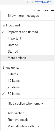
seem to be leveraging Gmail’s Priority Inbox, with the “Important and Unread” messages at the top of their inbox view, then the “Starred” email section right below that, followed by “Everything Else.


priority inbox setup 3 Gmail tricks that can save you hours every week


Priority Inbox also gives you the ability to change say the top section to show only emails from a particular label by going to “More options” via the drop down icon to the right of the section title

                                                          priority inbox options 3 Gmail tricks that can save you hours every week


Emails coming via Twitter (like retweets), New Relic (Performance Dashboards), and so forth are interesting to me, so I don’t want them to skip the inbox, but they are certainly not critical for me to read first.I found a liberal search filter “from:notify OR from:info” that covers many of these emails. For the subscriptions I don’t want to see, I simply unsubscribe (see below for some tips on that).Make sure to order the sections from top to bottom in the order you want the emails to be displayed. You might have an email that gets associated to multiple labels, and the exclusive section an email falls into will be the first matching section from the top.

2.Use canned email template responses


Gmail has a nifty lab feature for creating and embedding email templates to speed up your email follow-ups for common tasks. I use it extensively for recruiting follow-ups (screenshot below), common legal contracts, and meeting requests – check out these instructions, which are very easy to follow.

                   email recruiting template 3 Gmail tricks that can save you hours every week


3. Proactively unsubscribe from unwanted mailing lists


Lifehacker has this tip for mass identifying mailing lists and filtering them out of your inbox. Personally, I prefer to just manually unsubscribe from each mailing list by clicking the unsubscribe links at the bottom of these messages. That way, I don’t miss any mailing lists I do like seeing.Personally, I’ve found that Gmail’s “Report Spam” feature is not aggressive enough. I’ll still get similar emails from that mailing list coming through over and over again despite repeatedly reporting them as spam.Given the recipient is the same, it’s better to filter these out anyways and use “Report Spam” for the hard emails which are difficult to capture with search-based filters.If you unsubscribed from a mailing list but it’s still haunting you, it might be because the first unsubscribe associated you to another email address.
strategies useful in taming your inbox. It takes time to get your email environment setup properly, but trust me, it’s totally worth the small investment of implementing best practices now to save many more wasted cycles going forward.Keep in mind that everyone’s inbox needs are different. There’s unfortunately no one-size fits all solution, so personalize these techniques as you need to.If you have any suggestions or additional tips for managing email please comment on those below or reach out to me – I would love to hear them.
ALSO READ: CLICK HERE


Monday 14 July 2014

Sony Xperia Z3 Latest Features And images

Sony Xperia Z3 Latest Features And images

Hello My dear Friends! Sony doesn’t want to wait until next year to churn out the successor to its flagship. After launching the Z2 at the Mobile World Congress in February, the Z3 may enter markets in September, reports TheInquirer. The report states that Sony could launch the Z3 as well as the Z3 Compact at the IFA this year.According to a report by PCAdvisor, a ‘leaked screenshot of the rules for a raffle competition that runs from 1 July to 30 September’ by Vodafone Germany suggests that the Z3 and Z3.


several images of the alleged Z3 have also surfaced.Xperia Blog has got its hands on some leaked images of the alleged devices. The leaked images show the L55t model that runs Android 4.4.4 KitKat with firmware build 23.0.G.0.98 The image also confirms quad-core Qualcomm Snapdragon 801 MSM8974-AC chipset that clocks at 2.5GHz and Adreno 330 graphics. The pictures further confirm that Sony will be using similar optics that were seen in the Xperia Z1 and Xperia Z2, along with 20.7MP Exmor RS lens. The report also shows a couple of other images of the device showcasing the notifications section and lower edge from the rear side. Another leaked image shows the Xperia z3 next to the Galaxy Note. Now, the Note measures 146.9 x 83 x 9.7 mm, so you get a fair idea about the dimensions of the Z3. It should be noted that Samsung is rumoured to working on the Note 4 that will be launched later this year, and Sony is already gearing up with a competitor. The Note 4 will also likely arrive at IFA, if Samsung’s past track record is any indication. Whether Sony will succeed in stealing Samsung.


ALSO LEAKED TOP MOBILE: CLICK HERE
Windows 8.1 Latest Updates

Windows 8.1 Latest Updates

Hi Friends! Windows 8.1, a free update designed to address some of its users’ concerns and enable a faster pace of Windows releases, Microsoft tries to bridge the gap between old and new, between mouse and touchscreen. The new OS looks and feels mostly the same, but its many small tweaks make for a significant update  and hint at the future of Microsoft's vision for its own computing platform. Microsoft is completely invested in Windows 8, and it’s been busy over the last twelve months, but making Windows 8.1 into something easier and more familiar is no small task. Microsoft’s chance to usher in the touch-friendly.


Windows 8.1 PC you won't notice many differences from Windows 8. The boot process is still quick, Live Tiles still greet you after you sign in. However, as you start to navigate around, subtle improvements become apparent. First-time users will see tips for navigating between apps or around the OS after the initial demo during setup, in a similar way to how Windows 95 greeted new users. They're useful as initial hints, and a new dedicated Help + Tips application serves as the central point for anyone left confused by the new user interface.


Microsoft announced today that it was updating its Bing apps with new features for users of the developer preview of Windows Phone 8.1. Everyone else will have to wait.The biggest update is single sign-on. You’ll no longer have to sign in to each Bing app individually. You sign in once and your account is added to each Bing app you choose installed on your phone.For the foodies out there, the updated Food & Drink app is receiving cooking tutorial videos from the Rouxbe Cooking School, how-tos from famous chefs like Wolfgang Puck, Jacques Pepin and Vikas Khanna, and a personalized Source Hub where you can place all your favorite food related content in one spot.

                                                         0711 ms 220x366 Bing apps for Windows Phone 8.1 getting single sign on and flight tracking, everyone else has to wait
Bing Travel app now has flight tracking so you know if your flight is running late and the New York Times is being added to Bing News.All of this sounds great if you have Windows 8.1 which is in developer preview right now  on your phone. If you don’t, this is what Microsoft says, “it will be available to existing users running compatible hardware and on the next wave of Windows Phone devices in the coming months.

ALSO LATEST WINDOWS UPDATES : CLICK HERE

Sunday 13 July 2014

iOS And IOS X Latest Features

iOS And IOS X Latest Features

Hi Friends! every day that one gets to witness dramatic change happening quietly at Apple, but that’s exactly what took place on Friday, as the company’s Swift teamlaunched its very own official blog.As you may recall, Swift is a new programming language that senior vice president Craig Federighi announced at this year’s Worldwide Developers Conference, which took place in San Francisco at the beginning of June. Designed to at least for now run alongside the venerable Objective-C, which harkens all the way back to the days of NexT and OS X 10.0, Swift is meant to modernize the way developers build their apps by adopting many paradigms that have been available in other languages for a long time.


Apple’s Developer Connection website has had a blog for many years, its contents are generally limited to fairly formal communications on everything from app review policies to the occasional scheduled downtime that affects the online tools used by programmers to publish their software to the various App Stores. Outside of WWDC and the occasional Techdebute.com , Apple’s relationship with developers has always been so, well, sterile that something as informal as a blog seems almost like a slightly offbeat prank. brings me to the second reason why the Swift blog is significant: It signals just how vested Apple is in its new language, and how much its management wants it to succeed.Even based on my brief exposure to the new technology, it’s clear that Apple has invested a considerable amount of time and resources on it particularly when you consider that it had to adapt thousands upon thousands of APIs for everything from graphics drawing to hardware communication so that they would work seamlessly with it.It’s clear, then, that Swift isn’t just an experiment, or a “hobby.” It’s the tool with which Apple wants to see tomorrow’s apps built, and the language that is going to get the most care and love going forward.

         
programming resources, however, are not going to be enough to give Swift the boost it needs to succeed. Unlike languages like Java, which is broadly used on everything from Android devices to large-scale financial systems, it is purpose-built to satisfy the very specific needs of Apple’s own platform.In order to thrive, Swift needs one thing above all: developer buy-in. That’s something that the company can only achieve by getting programmers as invested in its growth and evolution as possible. Personally, I wouldn’t be the least surprised if this blog were but the opening salvo in a barrage of new initiatives centered around getting developers acquainted with Apple’s plans for a future in which every app is built in Swift.

                                        swift primary
Regardless of the motivations behind it, this blog is great news. Apple’s attitude towards developers has improved by leaps and bounds since WWDC, and the fact that it continues to do so can only mean that the tools and resources available to programmers will continue to improve at a rapid pace a benefit that will ultimately trickle down to us users in the form of better and more innovative apps.


ALSO READ MORE LATEST NEWS : CLICK HERE