Wednesday 18 June 2014

How To Use iOS 8 Additions Streamline Communicate And Share

How To Use iOS 8 Additions Streamline Communicate And Share

iOS users will have plenty of new things to familiarize themselves with this fall. That’s when iOS 8 arrives, and Apple’s updated mobile operating system promises a slew of new features and enhancements that aim to help you communicate and share more easily.While most of us will have to wait until the fall to really explore the many changes announced Monday during the Worldwide Developers Conference keynote, app makers and developers will get an early crack at iOS 8, with a pre-release version available now for anyone with a developer account. Here are the features we’re most excited to see.Apple introduced new interactive notifications that allow you to respond to alerts without having to leave the app you’re in. Get a calendar invitation, and you can respond, all while continuing to compose that email or—more likely—play that mobile game. You can also interact with notifications from your mobile device’s lock screen, swiping on a notification to deal with it.

                                   
OPTIONALLY SEE BELLOW:
 iOS 8 adds most frequent contacts across the top of the multitasking menu, allowing you to quickly call, text, or FaceTime friends, family, or other VIPs.
Mail: Mail will get several new tools in iOS 8, starting with the ability to add an event to your calendar directly from within an email message. Mail now incorporates several new gestures into the interface, letting you swipe to flag, delete, or mark an email as unread. Dragging all the way across on a message will delete it from your mailbox.
Perhaps one of the coolest feature in iOS 8’s Mail will be the ability to minimize drafts by swiping down. With this feature in place, you’ll be able to more easily grab information from one message and put it in another.
                      
Safari: The built-in browser for iOS is in line for a few updates as well. Safari’s quick-glance tab view from OS X comes to the iPad version of the browser as will the just-announced sidebar slated for OS X Yosemite, which Apple also previewed on Monday.OS X’s Yosemite update also inspires some new spotlight features in iOS 8. Searching for “Yosemite,” for example, brings up the Wikipedia page for Yosemite, news, and all other kinds of relevant information.
Keyboard: A new keyboard in iOS 8 will use predictive typing to speed up input. As you type out words with the new keyboard, recommendations for the next word based on common phrases will pop up; you can then add those to your message. We’ve seen this a bit with the keyboard in the SwiftKey Note app, but Apple’s solution goes a bit further to learn your personal voice (all the while maintaining your privacy, Apple executives were quick to add during Monday’s keynote.)
Continuity features: Apple wants better integration between all those devices you own, so iOS 8 is going to let you pick up on your iPad what you were doing on your iPhone. That includes taking phone calls on your tablet by more easily creating a portable hotspot for sharing your phone’s connection.
Messaging: Enhancements in the Messages app in iOS 8 focus on group messaging; you can add and remove people within a thread. Other enhancements let you name your thread for easily tracking or turning on a Do Not Disturb setting for a particular thread. You can share your location with people in a conversation;if they’ve shared with you, you can see their location on a map.
iCloud Drive: iCloud Drive promises a better way to work across applications in iOS 8. For example, if you’re working in an app such as Sketchbook, you can open up a document from another application and edit them in that app.
Photos With iOS 8, photos will be integrated with iCloud so that every photo you take will be available on all your iOS and OS X devices. To help you sort through all the photos in iCloud, you can search by location, time, and albums you’ve set up. And there are smart editing controls that help you quickly edit and crop photos from your device.
Siri. Siri also gets some enhancements in iOS 8. Saying “Hey, Siri” will now let you interact with Siri in your car so you don’t have to touch your phone while driving. (OK Google, that feature may sound pretty familiar to you.) Siri will also add Shazam integration to help identify the song that’s currently playing on the radio; you can buy that song using voice commands from Siri. Apple’s digital assistant also gains streaming voice recognition and 22 new dictation languages in iOS 8.
ALSO NEWS FOR IOS 8 : CLICK HERE
OS X Yosemite Mac interface rebuilt For Retina

OS X Yosemite Mac interface rebuilt For Retina

Hi Friends! OS X's look and behavior were imminent. The conventional wisdom during the Lion and Mountain Lion eras was that Apple had placed OS X on a collision course with iOS, and inevitably the two would come together to form...well, if not a single operating system, then two variations on a single theme.In the past year, though, it’s become clear that Apple no longer believes in that approach, if it ever truly did. iOS 7 took big, bold steps in one direction and OS X Yosemite takes smaller steps in a different one. After spending several days running Yosemite (on a Retina MacBook Pro provided to me by Apple and pre-loaded with the first developer release), it’s clear that Apple has a very clear and distinct future in mind for the Mac even though some of today’s Apple hardware might not be up to delivering it.
                                    
 WWDC, Apple unveiled the 15-inch MacBook Pro with Retina display, and a few months later the 13-inch models arrived. But two years into the Retina Mac era, there are still no Retina iMacs or MacBook Airs, nor are thereaffordable external Retina displays.For a while now, I’ve thought that 2014 would be the year that Retina spreads across the Mac product line. After spending time with Yosemite on both Retina and non-Retina systems, I’m more confident than ever in that guess. Yosemite’s new design feels like it was built for Retina displays: Thin Helvetica Neue replaces the long-serving but chunky Lucida Grande as the system typeface. Transparency is more present than ever before, inside app windows and underneath toolbars and even on the login screen itself.OS X Yosemite is gorgeous on such a display. So here’s hoping Apple rolls out high-resolution iMacs, MacBook Airs, and (dare I hope?) an external display later this year; if it does, Yosemite’s refined look will be able to shine up and down the product line.Apple showed off a new "dark mode" for the OS X interface when it previewed Yosemite at WWDC. Unfortunately, the build of Yosemite I received didn’t implement this feature. I’m looking forward to seeing what OS X feels like when it switches to light text on a dark background. Mac uses a display that’s a lot wider than it is tall. So in the Mac interface, height is at a premium, while there’s width to spare. (This is why I don’t understand why people leave their Dock visible on the bottom of the screen I’ve always pinned mine to the right side.) Yosemite’s design tries to fit more stuff on your screen by cutting the height of many window title bars in half.
This has a ripple effect on other interface elements. Take, for example, those stoplight buttons that were previously on the same level as the centered name of the window and, far off to the left, the double-headed arrow icon for full-screen mode. Now those buttons share space at top of windows with other interface elements.
In Yosemite’s version of Safari, the three buttons are on the same level as toolbar elements such as the next/previous page button, the address/search bar, and the like. In fact, in Safari the name of the window (and, therefore, the title of the page you’re viewing) is completely gone.
moving stoplights
design isn’t consistent across all of Apple’s apps, either. (Since this is an early developer-preview edition, things could certainly change before Yosemite reaches users this fall.) The stoplight buttons share space with the toolbar in the Calendar, Maps, Messages, and Reminders apps. (Philosophical question: If a bar contains no title, can it still be called a title bar?) Yet Mail, TextEdit, Preview, and iWork all look the same as they ever did.
I don’t really mind the trend—I use an 11-inch MacBook Air every day, so I know about cramped working environments. By merging the toolbar and title bar, this approach saves some precious vertical space. Unfortunately, an overly cluttered title bar might be hard to reposition on screen if you can’t find anywhere to click that isn’t covered by a button. And while those old title bars featured an awful lot of empty space, sometimes such space can be good. Yosemite’s new look can lead to situations where windows feel more cluttered.

Monday 16 June 2014

Surface Pro 3 Main Features

Surface Pro 3 Main Features

Hi Guys! Windows XP Tablet PC Edition, this device practically dared its owners to enter text without assistance from a bundled snap-on keyboard. It was frustrating then, and it's a museum piece now. Yet the TC1100 was perhaps the best hardware expression of Microsoft’s original tablet effort, and it still tells an instructive story about the origins of Surface Pro 3.machines were expressly designed as 2-in-1, laptop-tablet hybrids. Both come with styluses. And both feature fully functioning Windows desktops. TC1100 isn’t easy to use by any means, but it shows Microsoft had the right idea.

                                
 box of discarded tech toys since 2004. I first wrote about the tablet in May of that year, and generally liked HP’s effort. But it didn’t take long for the tablet’s considerable avoirdupois to break my spirit. Even worse, I never warmed to Microsoft’s primitive handwriting recognition.I eventually lost the TC1100’s bundled keyboard, which turns the device into a full-blown laptop. But when Surface Pro 3 came out, I was excited to discover that the HP tablet still booted, and more or less worked—the utter vulnerability of Windows XP notwithstanding.comparison with Microsoft’s flagship tablet, the first thing you’ll notice about the TC1100 is its weight. At 3.1 pounds, it weighs almost twice as much as the 1.76-pound Surface Pro 3. And let’s not forget that the first-generation iPad, released in 2010, weighs only 1.5 pounds. HP’s device is a brick compared to either machine, and its 1GHz Pentium M processor also runs quite hot. The end result is a tablet that scorches your lap, and begins to feel like a kettlebell if you hold it in your hands for too long.
                                
 HP tablet doesn’t respond to any of the swipes, finger jabs, or touch gestures that bring life to modern capacitive touchscreens. In 2004, the best the PC industry could muster was stylus-driven touch that depended on direct pressure applied to the screen. The first iPhone gave us capacitive touch as a standard in 2007, and modern mobile interfaces exploded from there. We began finger-gesturing through apps instead of mousing through applications, and an entire new computing experience was born. keyboard accessory, it’s all but indistinguishable from any other laptop circa 2004. The Pentium M is paired with a paltry 512MB of RAM and a 40GB mechanical hard drive. Running the stylus-oriented tablet edition of Windows XP, that aging boot drive yields start-up times exceeding 15 seconds an anachronism in today’s era of solid-state storage and instant-on tablets. In fact, even the Surface Pro 3 boots from completely off to its Windows 8 password screen in about four seconds.
                                 
Your first text-entry option involves using the TC1100’s stylus to tap-type on Microsoft’s awkward virtual keyboard (see the video at the top of this article). It borrows the layout of a traditional notebook keyboard in all the worst ways, and for some inexplicable reason, Microsoft labeled each key with a tiny, faint, barely legible key character. Using a stylus to hunt-and-peck letters into a Word document is not a rewarding experience.
ALSO READ : CLICK HERE

Saturday 14 June 2014

World's Lightest Mobile Released And Features

World's Lightest Mobile Released And Features

Hi Guys! mobile devices brand Xolo is all set to soon launch what could be world's lightest phone.Sources told TOI Tech that the company is gearing up to introduce its first Windows Phone-based, ultra-light smartphone in early July. The phone, part of its Xolo Win series, will run on Windows Phone 8.1 mobile operating system.It will be a budget device priced around Rs 12,000 and is likely to be the lightest ever phone, weighing a little under 100 gram.A Xolo spokesperson, however, refused to confirm the details, saying the company did not want to discuss its under-development phones or the launch road map.However, TOI Tech has learnt that the Xolo Win smartphone could sport a 4.7-inch screen and will be powered by Qualcomm's Snapdragon 200-8212 quad-core processor.

                             
Windows Phone handset by an Indian company as rival Micromax is set to beat Xolo with the launch of two budget WP 8.1 smartphones based on Qualcomm Snapdragon microprocessor on June 16.So far, Samsung Galaxy S4 mini remains the lightest phone at 107 gram, followed by Apple iPhone 5S at 112 gram and HTC Desire 500 at 123 gram.In past one year, Xolo has been establishing itself as a distinct brand different from its parent Lava which also sells under Lava brand name. The two brands have overlapping Android-based offerings, but Lava largely caters to entry-level phones.came the battle for anorexic phones as they started suffering from a Barbie syndrome, turning slimmer and lighter. Manufacturers got into the 'slimmer and lighter' race after Apple famously started putting its iPhone and iPad range on a strict diet plan.Even as Apple founder Steve Jobs felt smartphone users did not want a screen bigger than 4-inch in size, rivals globally went ahead and made phones with bigger screen sizes, sometimes overdoing it with obnoxious sizes like 6 inches (and above) that border on tablets. Thus the term 'phablets' was coined!

So far, Samsung Galaxy S4 mini remains the lightest phone at 107 gram, followed by Apple iPhone 5S at 112 gram and HTC Desire 500 at 123 gram.In past one year, Xolo has been establishing itself as a distinct brand different from its parent Lava which also sells under Lava brand name. The two brands have overlapping Android-based offerings, but Lava largely caters to entry-level phones.

ALSO READ: CLICK HERE

Friday 13 June 2014

Samsung Galaxy Tad S Features

Samsung Galaxy Tad S Features

Hi Guys Here Latest Released Mobile And Tablet's and All new & Top News tell Us TO Tell TECHDEBUTE.com , Said by the Samsung is taking the fight to Amazon and Apple with the introduction of the Galaxy Tab S tablet. The new tablets, available in 8.4-inch and 10.5-inch varieties, are thinner and lighter than the Kindle Fire HDX or iPad Air. What's more, Samsung has worked deals with many app and content providers to provide a heap of free stuff for its new customers.Galaxy Tab S boasts reasonable specs: either an Exynos 5 Octa or Snapdragon 800 processor (depending on the market), support for multiple mobile frequencies, an 8 megapixel rear camera and 2.1 megapixel front-facing camera, full 802.11ac Wi-Fi with MIMO, 3 GB of RAM, and either 16 or 32 GB of internal storage (expandable with a microSD card). It's a little disappointing that the processor isn't the newer and very impressive Snapdragon 801, but those are still great specs for a high-end tablet.

                                         
Weight is very important in a tablet. Holding it up with one hand while reading a book or playing a one-hand game gets tiresome quickly. Samsung says the 8.4-inch Galaxy Tab S weights 10.5 ounces (for the LTE model), 3 ounces lighter than the Kindle Fire HDX and even 1.5 ounces lighter than an iPad mini. In the smaller tablet, Samsung has still managed  to stuff in a hefty 4900 mAh battery, while the larger tablet gets a 7900 mAh battery.Samsung claims the world's best tablet display is to be found in the Galaxy Tab S. The OLED panel has a resolution of 2560 x 1600 on both the 8.4 and 10.5-inch models. This gives the smaller tablet a PPI (pixels-per-inch) of 359, and the larger one a PPI of 288. That's quite sharp (especially on the smaller version), meeting or exceeding Samsung's closest competitors. 

            galaxys adobergb

Samsung customized app will give Tab S users a free book every month, in addition to the usual Kindle library. Tab S users will get "access to a range of movie and entertainment content," as they put it, on Google Play. This includes the film Gravity, as well as a variety of books and magazines. The Tab S will also be the first Galaxy product to play Netflix content in full HD.

            content home


Samsung has lined up a host of other "Galaxy Gifts" for its users, mostly in the form of long trial subscriptions to content services, and some free apps an in-game purchases in games. The full list is below.The Tab S will be available in some markets by the end of June. In the U.S., the Wi-Fi version of the tablets will go on sale in July, with the 8.4-inch model costing $400, while the 10.5-inch model will be $500. The LTE models will follow shortly after.
How To Sort Facebook Feed By Time On Your Mobile Easy

How To Sort Facebook Feed By Time On Your Mobile Easy

Hi Friends! Parents need to know that teens must be diligent about setting privacy controls on Facebook. Every time Facebook updates its features, users must check settings to confirm what information they're sharing and what they're keeping private. "Frictionless sharing" apps -- which allow users to share without having to take action -- bring additional privacy concerns. The Facebook timeline shows every activity going back to a user's first post. It's like a permanent record, but the good news is that you can use it to delete posts you really don't want there anymore or change a post's privacy setting for it to be viewable only by yourself.Privacy shortcuts in the upper-right-hand corner of the page allow you to remove personal information like your gender or birthday, and you can block search engines from showing a direct link to your timeline. To completely remove previous posts from searches, you'll need to review your Activity Log to see a list of all your Facebook activity and review or edit the privacy setting for each item. After you've made privacy updates, you can double-check your changes by clicking View As, which will show you what your timeline looks like to a specific friend or to the public.

                          
Facebook thinks it knows what the best stories are to drop in your news feed. But some users might want to see things their own way.As an alternative to its default filtering algorithm, Facebook provides a way to sort your friends' posts by chronology in its mobile apps. But some people say the process for doing so is not that awesome.After a recent change to Facebook's app on iOS, a number of users say the company has essentially buried the sort-by-time feature. Taking to online discussion boards to complain, they also lament the fact that there is no way to set the mode as a default on mobile.Facebook's algorithm sorts posts that appear in people's news feeds, using signals such as the number of likes the posts generate and who posted them. As a result, posts that generate a lot of activity can stay lodged toward the top of users' feeds, maybe even over the course of a day. Facebook calls this default setting "top stories."
                           
For users opting for a chronological view of their posts, there is an easy way to change the setting on the desktop. But changing the setting on Android -- and now iOS -- requires a different process, one that some users don't like, or aren't even aware of."Please restore the 'most recent' news feed option back to its prominent location in the iOS version of the app," one person said in the discussion boards. "I have top stories show up that are days old because of whatever dumb logic Facebook employs."In this Tech Tip video, IDG News Service shows how to navigate the sort-by-time feature on both mobile and desktop. Facebook also provides some other personalized news feed options based around users' personal affiliations, jobs worked and schools attended. Users can add specific people to these lists if they want, which can be accessed from both mobile and the desktop.
Facebook is constantly tweaking its filtering algorithm. Late last year, as part of an effort to display more "high-quality" content, the company said it would be emphasizing news articles in the feed. But high quality to one person may be of a different quality to another.
ALSO FACEBOOK MORE TIPS: CLICK HERE

Thursday 12 June 2014

How To Maximize Storage Space On Windows Tablet

How To Maximize Storage Space On Windows Tablet

Hi Friends! Windows-based tablets is limited storage space. It is not uncommon for low-priced tablets to come with only 32GB or 64GB drives.A large chunk of that space is taken up by the Windows operating system and any preinstalled applications. Luckily, there are plenty of things you can do to rid Windows tablets of unneeded data to stretch that storage space as far as possible.Windows accumulates temporary and cache files like it's in an episode of Hoarders, filling your limited storage with old items you probably don't need. Performing a disk cleanup will delete a good chunk of the junk data stored in the Windows temp folder. To get rid of it all though, you’ll have to delete it manually.
                                   
Restart your tablet, and when Windows has fully loaded, close or exit from any applications that placed an icon in your system tray (usually by right-clicking on its icon and choosing close or exit) to ensure they’re not using any temporary files.
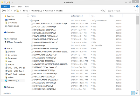
Next, click on the Libraries shortcut in your Taskbar, select This PC from the left column in the resulting window, and then double-click on your C: drive. Double-click on theWindows folder and delete all of the files in the Prefetch and Temp folders (C:\Windows\Prefetch and C:\Windows\Temp). As long as you have restarted and don’t have any applications running, deleting the contents of these folders should have no ill effects.
  Windows 8.1 prefetch file folder
Finally, go back to the root of the C: drive and navigate to the C:\Users\[Your User Name]\AppData\Local\Temp\ folder and delete everything in there as well.
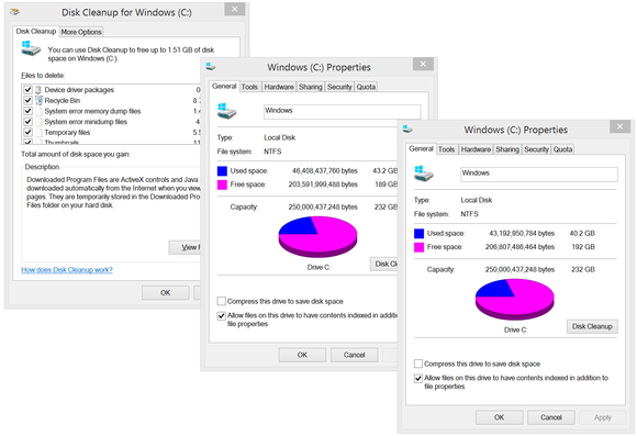
If you haven’t taken the time to purge old prefetch and temp data from your system, you may be surprised by how much space it was taking up.
Windows 8.1 Disk Cleanup utility
Running Windows’ built-in Disk Cleanup utility with its default options deletes some of the temporary data, log files, and installers that Windows can build up over time, among many other things. If you dig a bit deeper into its menus, however, you can also purge shadow copies of system files, error dumps, and old system restore points that can consume a ton of space.
RUN CLEANER;
CCleaner will rid Windows of a ton of junk data from temp folders and various caches, and it’ll do the same for many popular browsers and applications as well.
Download and install CCleaner and launch the application. On the Cleaner menu, you’ll see tabs for Windows and Applications. Read all of the items that CCleaner will purge from the operating system and various applications. Tick each checkbox for each item you want removed (I typically tick everything except the "Wipe Free Space" option).  If you're unsure, click Analyze and CCleaner will do its best to guess for you. Hit Run Cleaner when you're ready.